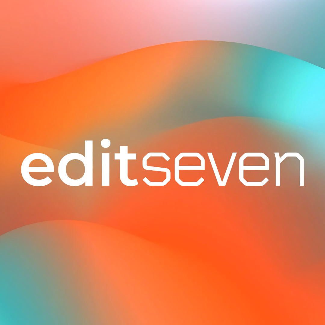
Edit Seven is a professional photo editing service provider with a global client base and international teams. I worked closely with the Managing Director to revamp the brand. The logo was refreshed, and branding elements were enhanced to reflect a more contemporary appearance, reflecting it's service users.
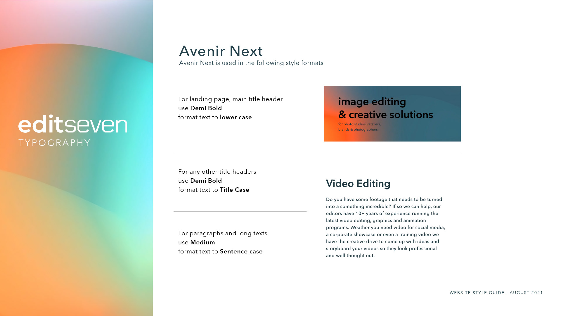
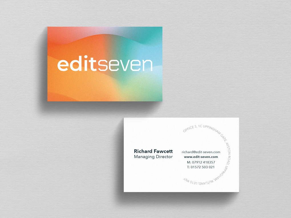
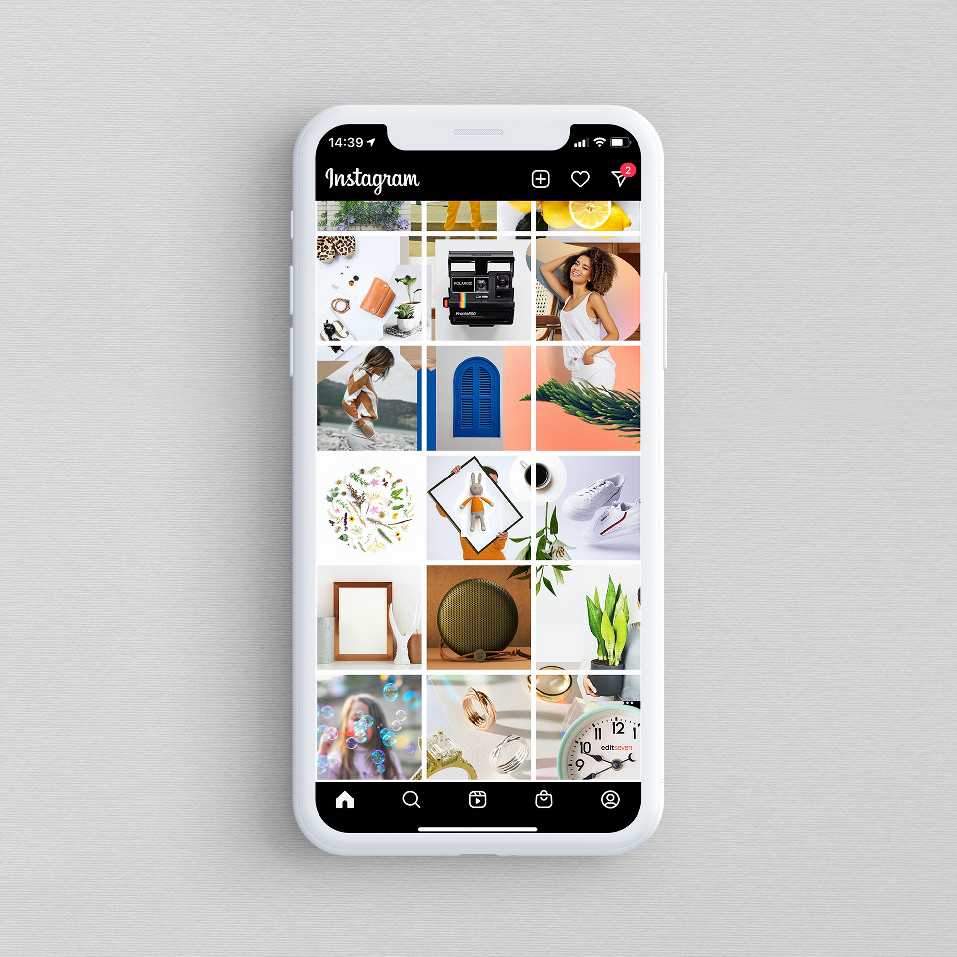
For this project, I designed the look of the new website and provided the team with brand style guides, business cards, animations, social media assets, and office décor. The logotype was retained for consistency and familiarity, while the branding evolved to include a broader colour palette, incorporating the original Edit Seven shade of orange alongside new complementary tones. These additions were specifically chosen to an more welcoming first impression, creating a vibrant and sophisticated adaptive visual identity, reflecting over their service offer and adaptability to current market demands.
This updated colour scheme was then integrated into a dynamic, liquid-morphing animation used as the backdrop for the website landing page. Organic shapes were used as framing elements to add contrast, resulting in a bold, sleek final product. Improved UX features on all pages and on client login user interface further clarified the services offered, enhancing the overall brand impression.

Previous logo left - Updated logo right
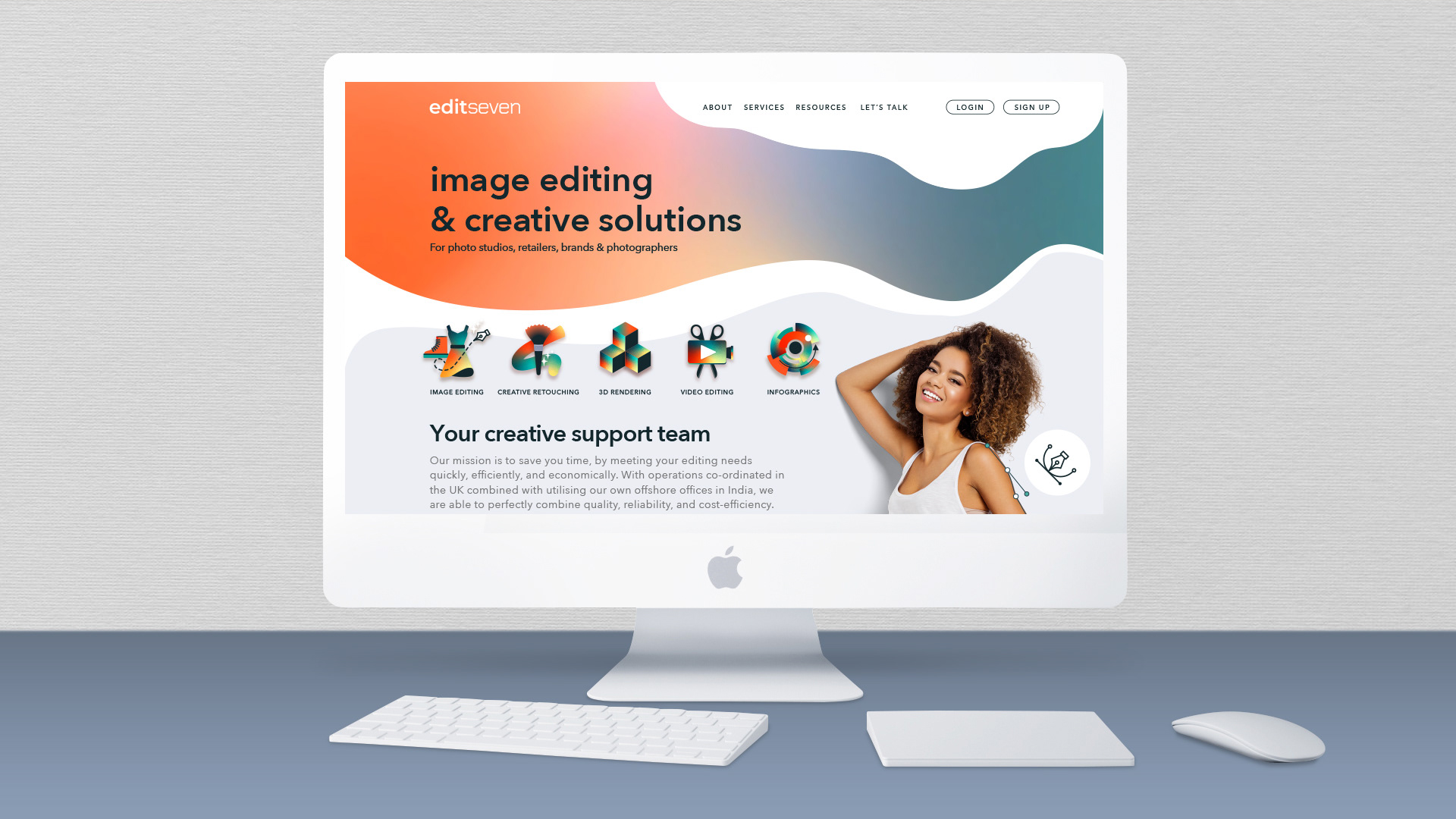
Website was updated to embrace a more intuitive, user friendly interface, featuring new inspirational imagery to showcase the service offering.
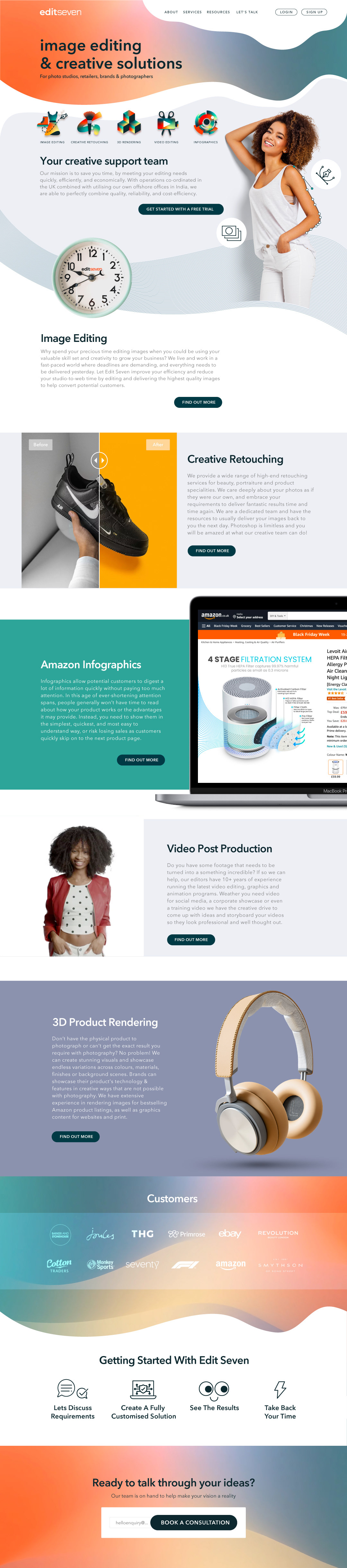

Colourful icons set created for main service offerings.

A further subset of monochromatic wireframe icons.